

How to design a church flyer: a step-by-step guide
How to design a church flyer in seven simple steps, from writing the headline to choosing the right size and one clear call to action.
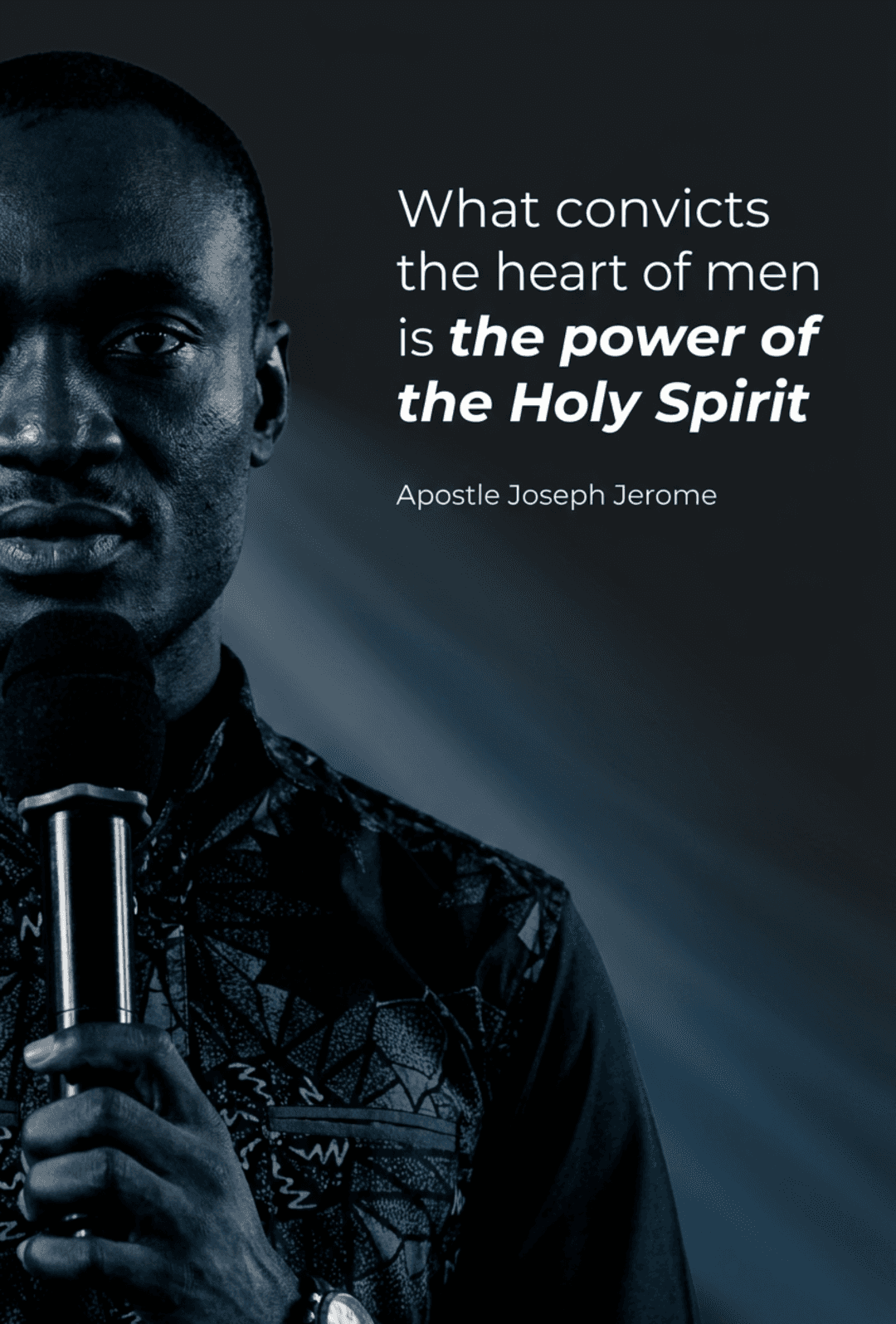
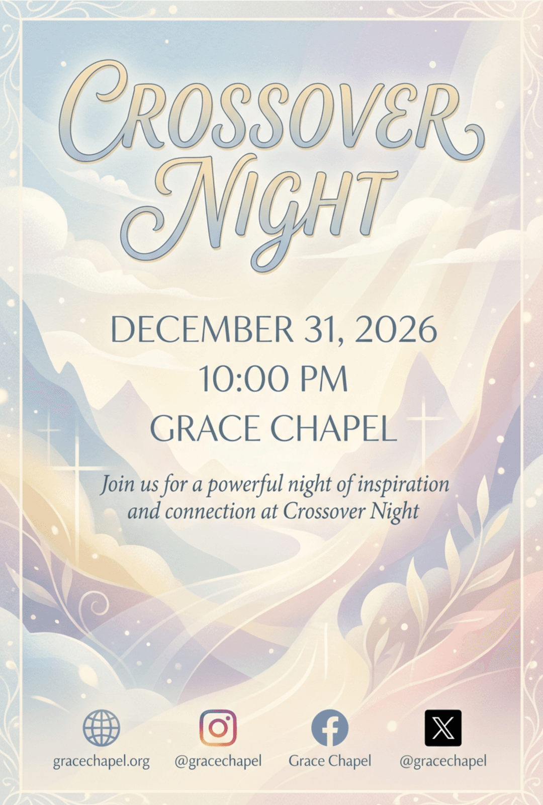
You do not need a design degree to make a church flyer people actually read. Most good flyers follow the same steps in the same order, and they come together faster than you think. Here is how to design a church flyer from start to finish, whether you use a template, a free editor, or an AI tool like Rhema.art. These steps work for a Sunday service, a youth event, a fundraiser, or a seasonal celebration.
How to design a church flyer: start with the headline
People glance at a flyer for about two seconds, so the event name has to do the heavy lifting. Keep the headline short, 3 to 6 words. "Crossover Night" reads faster than "Join Us for a Night of Worship and Fellowship." Write it on paper first. If the headline works in plain text, the rest of the flyer has a strong center to build around.
Test the headline out loud before you design anything. Say it to someone who knows nothing about your church and ask them to repeat back what the event is. If they hesitate, cut words until it is tight. Avoid inside language like a ministry acronym only your congregation knows, because a visitor will not decode it.
How to design a church flyer for the right platform
A flyer designed for Instagram Stories looks wrong as a lobby print, and the other way around. Decide the primary platform first. Use vertical 9:16 for Stories and WhatsApp, 4:5 for the feed, and 5.5 x 8.5 inches at 300 dpi for print. If you are unsure, the church flyer sizes guide breaks down every common format. Design one main version, then crop copies from it. Never stretch a square into a vertical graphic; the result will look soft and stretched.
Think about where your audience actually spends time. If most of your church is over 55, a lobby print and a Facebook feed post matter more than a Story. If you lead youth ministry, the flyer will live almost entirely on phones, so design vertical first.
Step 3: Use two fonts, not five
Choose one display font for the headline and one clean font for the details. A serif like Playfair Display paired with a simple sans like Montserrat is a dependable church flyer combination. More than two fonts makes a flyer feel scattered. Save script fonts for a single accent word, like "Welcome" or "Thanksgiving," and nothing else. The same pairing repeated across every flyer is what makes a church's graphics recognizable.
The two-font rule also settles the size question. Make the headline three to four times larger than the body text, then give date, time, and location their own clear level below that. When two text blocks look the same size, readers do not know where to look first. For pairings matched to your style, see the best fonts for church flyers guide.
Step 4: Choose colors with real contrast
Dark text on a light background, or light text on a dark photo, reads fast. Pastel text on a white background disappears. Pick two or three colors with one dominant, and check that the headline still reads from arm's length. If it does not, fix contrast before you touch anything else. When in doubt, lean on the church's existing colors so the flyer feels like it belongs to you.
A practical check is to convert the flyer to grayscale in your editor. If the headline still stands out when every color becomes a shade of gray, the design will hold up on a phone in bright sunlight and on a worn lobby bulletin board. Keep body text neutral and reserve accent colors for the headline.
Step 5: Make the details impossible to miss
Date, time, location, and the one thing you want people to do. That is the whole information list. Put these in one small, consistent block so they scan like a checklist. Ambiguity kills attendance. "Saturday, October 12, 6:30 PM" beats "this Saturday evening." Add a phone number or a QR code when you want people to RSVP or register in advance.
Write the date with the day of the week, the month, and the year, and include the address rather than relying on the church name, because visitors do not know where the building is. If the event repeats weekly, say so, like "every Wednesday at 7:00 PM through May." If it costs money, print the price or the word "free." Then pick one action, come, register, or bring a friend, and give it the most visible spot.
Step 6: Add one photo, not a collage
One strong image, a warm pastor photo, a shot of the congregation, or a scene from last year's event, supports the message. A collage or a busy stock photo competes with the headline. If the photo does not add anything, a clean colored background works better than a crowded one. Keep the image behind or beside the text, never in front of it.
Candid photos of your own people build trust, so look for shots of the congregation, last year's egg hunt, or the youth group playing games before you search stock libraries. For print, make sure the image is at least 300 dpi at the size you are using.
Step 7: Check the margins and share it
Keep all text at least 8 to 10 percent in from each edge so platform overlays do not clip it. Then post midweek for most church events, giving the flyer a couple of days to reach people. Posting a flyer the night before is the most common reason events stay empty. Reuse the same flyer for a same-day reminder Story so the event stays in front of people.
Build a simple posting rhythm so you are never designing under pressure. Post the main flyer three to five days before the event, refresh it with a new photo or a countdown two days out, and run a same-day Story with the times. On a 1080-pixel-wide design, the safe zone is roughly 90 to 100 pixels per side.
Frequently asked questions
Do I need design experience to make a church flyer?
No. Every step above is a decision, not a skill. Write a short headline, pick a size, choose two fonts, keep the contrast high, list the essentials, add one photo, and check the margins. Most people finish their first flyer in under an hour with a template or an AI tool like Rhema.art.
What is the best size for a church flyer?
It depends on where people will see it. Use 9:16 for Instagram Stories and WhatsApp, 4:5 for the feed, and 5.5 x 8.5 inches at 300 dpi for print. Design one main version and crop copies, and the church flyer sizes guide breaks down every format.
How much text should a church flyer have?
As little as possible. A headline of 3 to 6 words, a subtitle of one line, and a details block with date, time, location, and one call to action. If a detail does not help someone decide to come, leave it for the event page or the caption.
Should I use a template or design from scratch?
Start with a template or an AI generator, especially for your first few flyers. Templates enforce the structure above, and Rhema.art generates original designs you can adjust. As you get comfortable, you will start editing layouts more.
The short version
You can design a church flyer in seven steps: write a short headline, pick the right size, use two fonts, keep contrast high, list the essentials, add one photo, and check the margins before posting. Do those in order and the flyer does its job.