

How to make a sermon quote graphic in minutes
Turn one line from Sunday into a sermon quote graphic in minutes, even if you have no design experience. Here is the simple workflow.
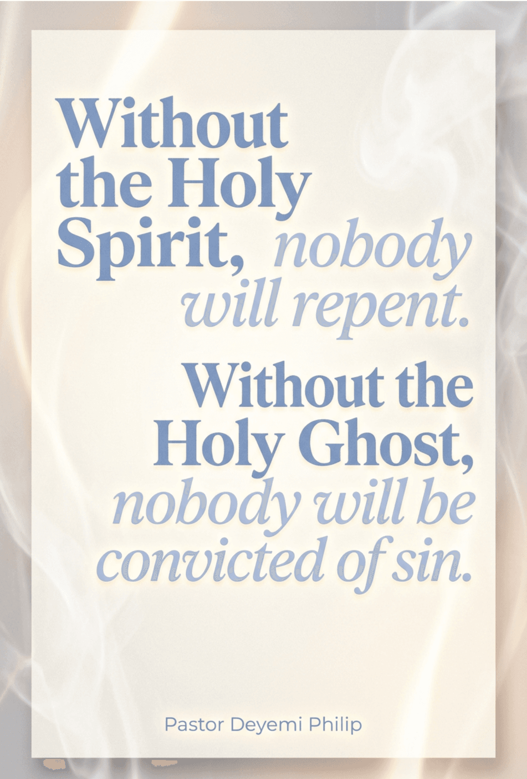
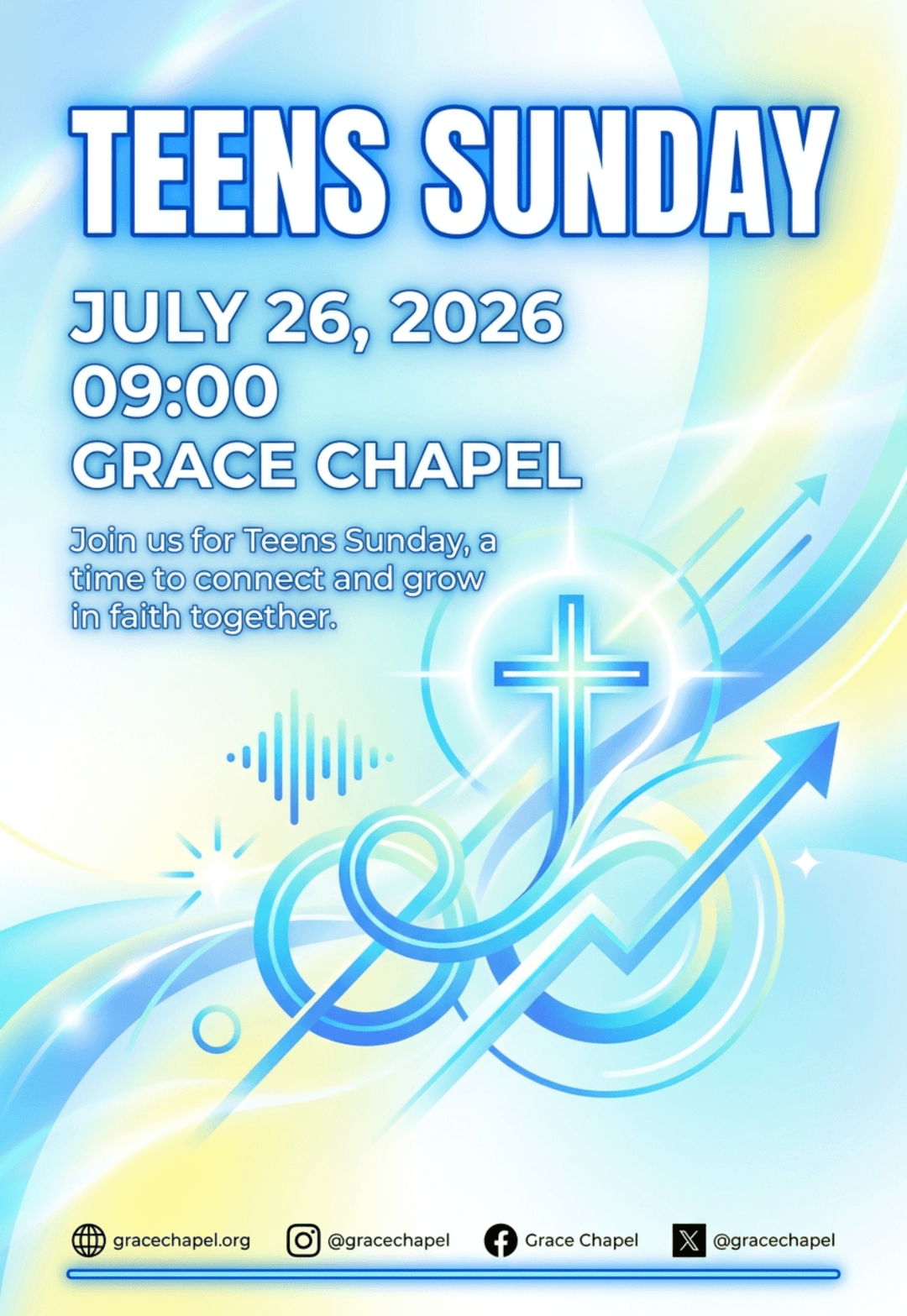
A sermon quote graphic takes one line from Sunday and turns it into something people cannot scroll past. It is one of the highest-return graphics a church can make, because the content already exists. You just have to lift it out of the message and onto a screen. Here is how to make a sermon quote graphic in minutes, even with zero design training. Once you have a system, the whole task takes about ten minutes, and the same workflow works for Instagram, Facebook, a lobby screen, or a bulletin.
1. Pull the line from the transcript, not your memory
Don't try to recall the exact wording an hour after the service. Open the transcript and find the moment. A quote graphic is only as strong as the sentence behind it, so pull the words as they were said. Most churches already record the sermon for YouTube or a podcast, which means the transcript is usually one click away. If you do not have one yet, turn on auto-transcription in your video platform or run the audio through a free speech-to-text tool. You want the raw words, not a cleaned-up version, because the line that works best on a graphic is usually the one as it was spoken.
- Look for the summary sentence. Pastors often state the point twice, once in the body of the sermon and once in the landing. The landing version is usually tighter. If it still runs long, our guide to choosing sermon quotes helps you trim it without losing the meaning.
- Cut the filler. Remove "you know" phrases and repeated connectors. Keep the meaning, trim the noise.
- Check the room reaction. A line that people responded to live, with laughter or a moment of quiet, will usually land again on social media.
2. Follow the anatomy of a sermon quote graphic
Every strong sermon quote graphic has the same bones: the quote in large type, the speaker attribution, and one visual anchor. Nothing else is required. If you look at your last five posts and one of these three is missing, that is the fix, not a new filter or a busier background.
- The quote itself. 20 to 30 words max. If it runs longer, split it or pick a shorter moment. At around 25 words, the line fills the canvas nicely at a readable size. Much longer and you are asking people to read a paragraph in the time they would normally scroll.
- The attribution. The pastor's name and the sermon or series title. This builds credibility and tells people where to hear more. Keep it small and consistent, in the same corner on every graphic, so it becomes part of your church's visual signature.
- One background. A single image or color field that never competes with the words. If you have to explain what is happening in the background, it is doing too much.
3. Keep the text big and the breathing room wide
People scan quote graphics in under a second. If the words are small, they keep scrolling. The number one mistake media volunteers make is designing for a desktop monitor when the audience is on a phone.
- Set the quote large enough to fill most of the width. As a rule of thumb, the quote should take up at least two thirds of the canvas. If it does not, increase the type size before you do anything else.
- Keep margins of at least 8% on every side so platform overlays do not cover the text. Instagram's interface elements sit along the bottom and right edges, so the extra breathing room is protection, not decoration.
- Use high contrast: light text on a dark image, or dark text on a light field. White text on a bright sky is the fastest way to lose a quote entirely.
4. Pull the palette from the sermon itself
The fastest way to make a sermon quote graphic feel intentional is to match the series. If the series uses warm tones, use warm tones. If the sermon talked about a storm breaking into sunlight, echo that shift in the colors. People connect the graphic to the message before they even read the words. You do not need to invent a palette from scratch. Steal two or three colors from the series artwork or from a photo you already used, and keep them consistent across the whole run. The result is a set of graphics that looks designed even when each one took ten minutes.
5. Quick fixes when your sermon quote graphic feels off
- If the layout feels empty, the issue is usually spacing, not content. Add breathing room before you add decoration. Empty space does not look unfinished, it looks intentional.
- If the text is hard to read, add a soft gradient behind it rather than switching fonts. A subtle dark panel behind white text solves most contrast problems without touching the typography.
- If it doesn't look like your church, compare it to your last three posts. Consistent fonts and logo placement fix this in one pass. Your audience should recognize the graphic before they read a single word.
6. Use a tool that removes the blank-canvas step
You do not need design software to make a sermon quote graphic. Tools like Rhema.art generate quote graphics from a sermon clip or quote, complete with headline, palette, and layout that already follow the hierarchy above. You can still open the result in the built-in editor and nudge anything that needs adjusting, or ask it to regenerate a single detail instead of starting over.
Pair this workflow with a bigger library of church design tips and the whole process takes less time than writing the caption. Once the quote is out, the same line can feed the rest of your week when you turn sermons into social graphics. And when the quote is a verse instead of a spoken line, the same layout rules carry over to our guide to Bible verse graphics.
Frequently asked questions
How long should a quote be on a sermon quote graphic?
Keep it under 30 words, and aim for 20 to 25. At that length the text can sit large and readable while still filling the canvas. If the line is longer, split it into two graphics or cut the sentence down to its strongest clause.
Do I need to ask the pastor before publishing a quote graphic?
It is a good habit. Most pastors are happy to have their message shared, but they also want to know which line is going out. If you pick the quote together on Monday, you avoid publishing something the pastor feels was taken out of context.
Can the same quote graphic work on every platform?
The design can, but the dimensions should change. A square crop works for the feed, a vertical version works for stories, and a wider crop works for Facebook. Keep the layout and colors identical and only adjust the canvas size, the same way you would build a consistent sermon series set.
How many sermon quote graphics should we post each week?
One main quote right after the service is a good baseline. If you want more reach, post a second quote midweek and a recap on Saturday. The key is a steady rhythm, not a burst of three posts on Sunday afternoon.
The short version
A sermon quote graphic is one clear line, large type, high contrast, and your church's signature. Pull the quote from the transcript, keep the layout simple, and let a tool handle the design step for you. That is how you publish one in minutes, every single week.