

How to use scripture in church graphics without cliches
Using scripture in church graphics without cliches is about restraint. Here is how to let the words breathe and avoid the tired, decorative look.
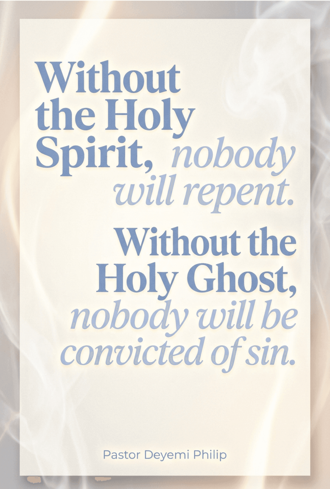
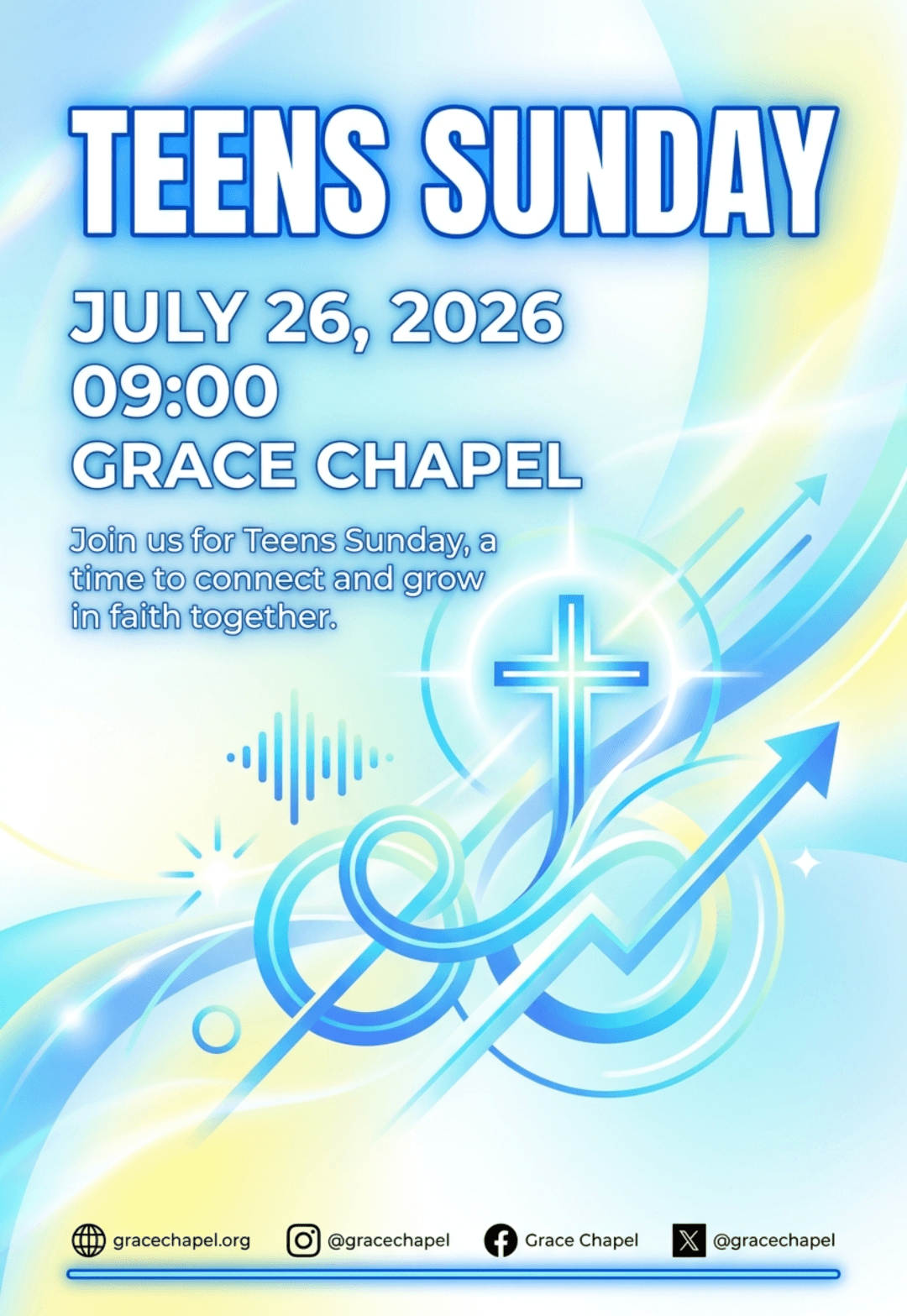
Some scripture graphics look like they were pulled from a stock template in 2012. The cliches are easy to spot: the parchment texture, the generic sunset, the ornate font that is hard to read. You can use scripture in church graphics in a way that feels fresh and honest. The secret is restraint, letting the words do the work instead of the decorations. When you strip away the props, the verse itself becomes the entire visual, and that is what makes a graphic worth stopping for.
1. Treat scripture in church graphics as content, not decor
Scripture is not wallpaper for a feed. When a verse becomes a background texture, it stops meaning anything. Treat each verse as the whole point of the graphic, and every design decision, color, type, spacing, should serve the reading of that verse. Ask yourself whether the design would still work if the verse were removed. If the answer is yes, the verse is decoration. If the answer is no, you have built the graphic the right way around.
2. Choose type that behaves
The fastest way to kill a scripture graphic is a display font that is pretty and illegible. Choose a typeface that reads clearly at small sizes and stick with it. A plain serif can look more reverent than a decorative one, because it lets the words be the star. The goal is a font you stop noticing, so the reader focuses entirely on the verse.
- Skip script fonts for long verses.
- Keep letter spacing normal or slightly generous.
- Use weight changes, not new fonts, to create hierarchy.
If you are unsure which fonts behave, our guide to Bible verse graphics walks through a small set of reliable options and how to pair them with a reference line.
3. Let one image do one job
A photo of a sunset, a lighthouse, or a mountain range behind a verse is a shortcut, and it usually says nothing about the words. Instead, pick one image that actually connects to the verse's meaning, or drop the photo entirely and use a strong color field.
- A color field gives the verse room and never competes.
- A meaningful photo adds context without needing explanation.
- Texture and grain add warmth without adding noise to the reading.
The test is simple: if the image could be swapped for any other pretty photo without anyone noticing, it is not doing a job. A verse about rest works with a quiet, empty frame. A verse about community works with a real photo of your congregation. Choose images that comment on the words instead of sitting behind them.
4. Respect the context of the verse
A verse lifted and dropped onto a graphic still belongs to a chapter and a story. If you are not sure the verse means what the flyer implies, read the surrounding passage first. Using scripture in church graphics responsibly means not turning it into a slogan that contradicts the passage it came from. Before publishing, ask whether the verse, as presented, says what the passage actually teaches. When in doubt, a pastor or a good study note can settle it in a minute, and that minute protects the church's teaching credibility.
5. Design for the reader, not the aesthetic
A graphic that looks beautiful in a gallery view can be unreadable on a phone. Keep margins wide, keep the type large, and always check how it looks at the size it will actually be seen. If the reader has to zoom to read the verse, the design failed even if it won a compliment. Test the finished graphic on a phone screen before you post, in both light and dark mode. If the words do not separate from the background, add a subtle panel or darken the image behind them rather than enlarging the type to the edge of the canvas.
6. Use scripture in church graphics sparingly
A feed that is nothing but verses starts to feel like noise, no matter how well they are designed. Save the verse graphic for the moments it earns: the core of a message, a season of the church year, or a word you know your community needs. Rarity is what gives the words weight back. You can mix scripture-based posts with sermon quotes and quote flyer ideas so the feed has a rhythm instead of a single note. For more on building a steady visual rhythm, see our church media resources and the 20 verses that travel well.
Frequently asked questions
Can I use decorative fonts for a single word or short phrase?
For one or two words, a decorative font can work as an accent, as long as it stays readable. For anything longer than that, switch to the clean typeface. The rule is simple: the longer the text, the plainer the font.
What should I do if a verse does not fit on the canvas?
Shorten the text or widen the layout, never shrink the type to force a fit. You can drop the opening clauses, use a shorter reading of the verse, or run the verse over two lines with generous spacing. Keeping one clean idea on the canvas beats cramming a full verse into a small space.
How do I know if a background image is too busy?
Check whether the verse is still readable at thumb size. If your eye goes to the image before the words, the background is too busy. A good rule is that the background should add mood without asking to be understood. When in doubt, reduce the image opacity or use a flat color field instead.
Is it okay to pair the same verse with different designs?
Yes. The verse stays the same, the design can change with the season or the series. What should stay consistent is the layout system, so every scripture graphic still reads as your church, even when the palette shifts. Our sermon series graphics guide shows how to hold a set together while letting individual posts breathe.
The short version
Scripture in church graphics works when the verse is the hero: clean type, one meaningful image or none, honest context, and design that serves the reading. Use verses with restraint, and the ones you do publish will finally carry weight again.