

How AI church flyer design works: a guide for ministries
Struggling to design church flyers on a tight schedule? Here is how a sermon quote or event idea becomes a finished flyer in minutes, no design software needed.
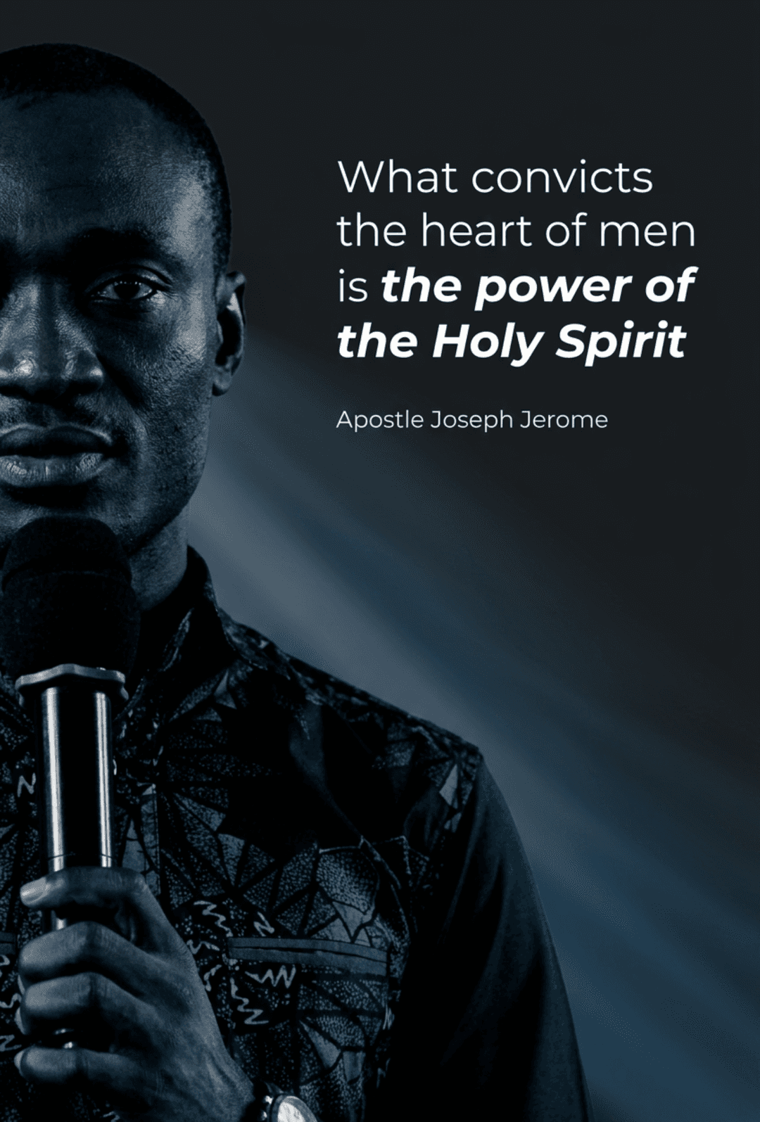
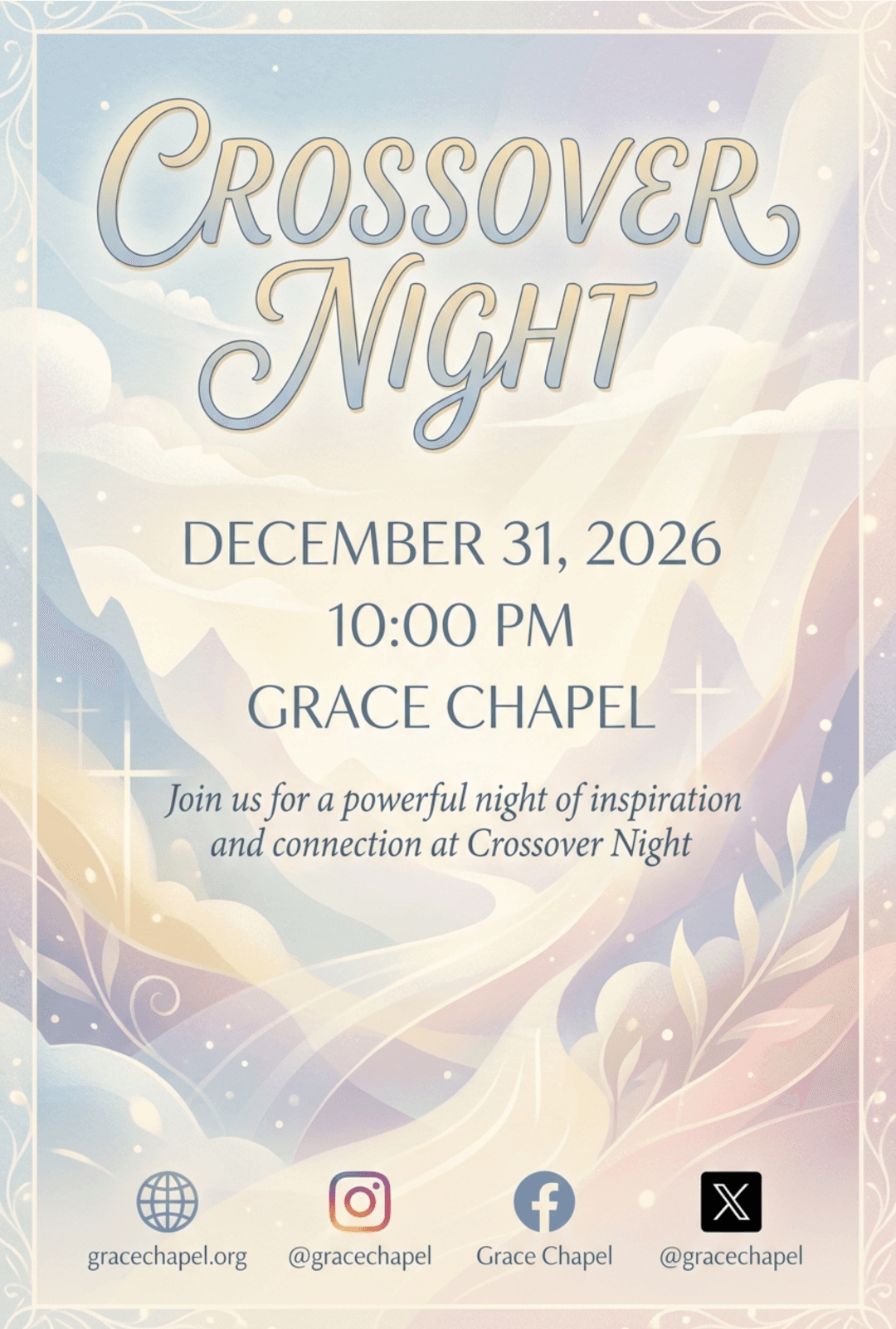
Church event flyers come down to three things: a headline someone can read in two seconds, a layout that survives every platform you post it to, and one clear next step. Get those three right, and the design itself stops being the hard part.
Whether the flyer is going on Instagram, printed for the lobby, or shared straight to a church WhatsApp group, the same principles hold. Here is how to get all three right, without spending a whole afternoon on one graphic.
1. Start with a headline people can read in two seconds
The single biggest mistake in church flyer design is burying the event name under a long, decorative title. A flyer gets glanced at, not read, so the headline needs to work at a glance: the event name, in large type, with nothing competing for attention above it.
A few things that consistently help:
- Keep it to 3 to 6 words. "Crossover Night" beats "Join Us for a Powerful Night of Worship and Fellowship."
- One dominant font size. Everything else on the flyer, date, time, location, should be visibly smaller than the headline. If three things are all fighting to be the biggest element, nothing wins.
- High contrast between text and background. Light text on a dark photo, or dark text on a light background, reads faster than text layered over a busy image with no separation.
2. Build a layout that survives every platform
The same flyer rarely gets posted in one place. It goes up as an Instagram post, gets forwarded on WhatsApp, and often ends up printed for the noticeboard. Each of those crops and compresses differently.
Two habits make a layout portable:
- Keep the important text away from the edges. Leave a comfortable margin on all four sides. Anything close to the edge is the first thing a crop eats.
- Design for the small version first. Look at the flyer at thumbnail size. If you cannot tell what the event is from the thumbnail, the headline is too small or too crowded.
3. Give people one clear next step
A flyer that says everything asks nothing. Decide the single action you want, then make it the only instruction on the page.
If people need to register, the flyer needs a short link or a QR code, not a paragraph explaining the process. If they just need to show up, the date, time and venue are the next step, and nothing else needs to be there. Phone numbers, social handles, sponsor logos, and a scripture reference all fight the one thing you actually want people to do.
Where AI changes the work
None of the principles above are new. What has changed is how long it takes to apply them.
Traditionally, getting a flyer right meant either learning design software or waiting on the one volunteer who knows it. Both cost you the thing you have least of, which is time between deciding on an event and needing to promote it.
An AI flyer tool shortens that loop. You describe the event, or paste the line from the message you want on the artwork, and you get a finished draft with the headline, layout, palette and imagery already in place. The design decisions are made for you as a starting point, not as a final answer.
That last part matters. A draft you cannot change is not much use to a ministry with a specific look, a specific font, or a service time that just moved. The useful version of this workflow is: AI drafts, you edit. You keep control of every word and every color, and you skip the blank canvas.
A practical workflow for a weekly flyer
If your team ships a flyer most weeks, a repeatable process beats inspiration:
- Write the headline first, in plain text. Before any design happens, agree on the 3 to 6 words. This is where most of the quality comes from.
- Collect the facts once. Date, time, venue, and the one next step. Put them in the same place every week so nothing gets missed.
- Generate a draft. Describe the event and the feel you want in normal language. Reference the mood, not design jargon.
- Edit for hierarchy. Check the thumbnail. Is the headline still the biggest thing? Is anything crowding the edges?
- Export once per destination. A feed post and a printed sheet are not the same shape. Export both rather than stretching one to fit.
Done consistently, this turns flyer design from an afternoon into about ten minutes, and it keeps the look consistent from week to week, which is what makes a church's social feed start to feel intentional.
The short version
Good church flyer design is not about having a designer. It is about protecting the headline, keeping the layout simple enough to survive a crop, and asking for one thing. AI can carry the drafting. The judgment about what the message is, and what you want people to do about it, stays with you.